
Buzzing with Innovation
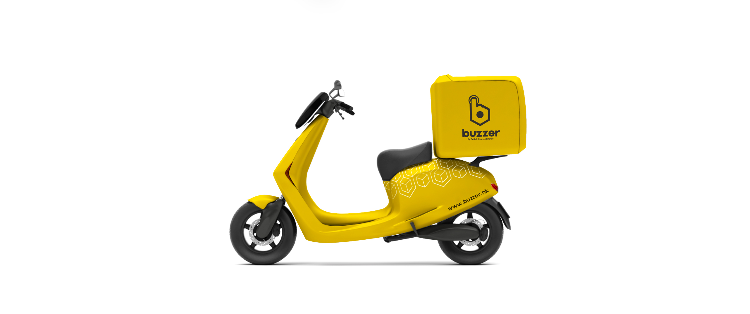
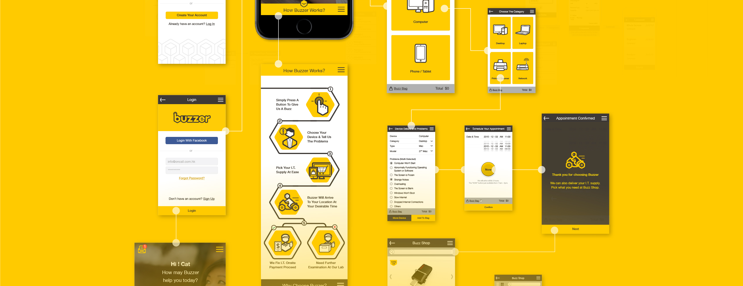
OnCall Services wanted to create a distinct brand emphasizing convenience and immediacy in IT solutions. Thanks to our simple UX design, Buzzer users can select their technical problems and when and where to receive assistance within a few easy steps. We also developed the brand’s concept and connected multiple meanings of “buzz” – from the buzzing sound of a notification to quick movement to the sound of a bee – for a catchy name and image. The logo represents the company’s quick response at the push of a button as well as the ease with which users can request service.

Brand Pattern
The cube pattern is formed by connection of two cubes, the main element shown below, and can be repeated without limit to form background pattern.
When compositing the pattern, please note that a small triangle in the red area will form when repeating the main element. Remove the connecting curve (shown in red circle) to form a simplified pattern.


BUZZER App!
Just scan the QR code or search for ‘BUZZER’. It’s a breeze! Fix your devices in a few taps. You will also get exclusive access to our events, promotions, updates and news via push notifications.


Customization Icons
We created a series of striking favicons for Buzzer using signature bold lines and the hexagon shape present in the logo to strengthen the brand image and consistency.
